


This tutorial is about using simple random shapes to create a stunning composition which revolves around typography. You will build elements in Illustrator, Photoshop and a 3D application – in this case Cinema 4D, though similar software can be used too – and then combine them with type and effects back in Photoshop.
Besides how to turn Illustrator elements into intricate shapes, this tutorial will show you ways to integrate abstract objects into any kind of work.
Software Required: Photoshop CS4 or later, Illustrator CS4 or later, Maxon Cinema 4D.
Step 1
Create an A4 300dpi document in Photoshop and, using the Elliptical Marquee Tool (M), draw a big circle in the centre to serve as a focus for all the shapes and the typography we’ll be adding. Fill it with a dotted pattern.

Step 2
Switch to Illustrator and start drawing some random shapes, adding gradients for variety. The more you experiment, the more interesting your shapes should get. You can use them as the main elements for the composition or blur them to be used as decoration. The possibilities are endless. Incidentally, don’t simply try to mimic what is shown in the screenshot – the aim is to create something distinctive and personal.

Step 3
Now paste the shapes into Photoshop as Smart Objects and build bigger shapes by moving them around. This is important, as the big shapes will support everything else we will be adding.
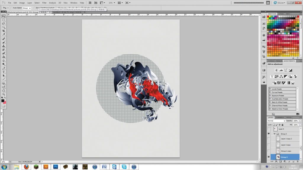
Step 4
We have a pretty foundation, but it needs more punch. You can add to the appeal by duplicating a few of the elements and changing their layers’ blending mode to Overlay. Introducing semi-transparent and other elements that interact with their backgrounds will make this type of piece more attractive.

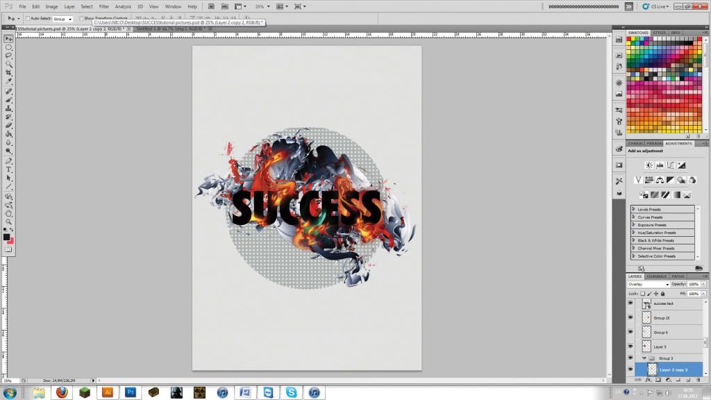
Step 5
It’s time to add our text – and we’ve gone for the word ‘SUCCESS’. Also create some smaller shapes, duplicate them, apply Filter > Blur > Gaussian Blur to them, and set their layers’ blending mode to Screen. Place them in front or behind the word to add depth to the image.
Step 6
Bring up the Adjustments panel and add a Levels adjustment layer. Set the white input slider to 240 and the middle input slider to 0.81 to darken the image a little. Also add a gradient map transitioning from black to dark grey, and set this adjustment layer’s blending mode to Screen.
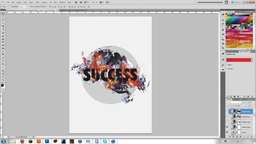
Step 7
Now add a few more gradient maps in various colours, modified with a Layer Mask. Then take a black brush and paint in those areas where you want specific colours from the maps to appear. We’re getting close to a pleasing result.

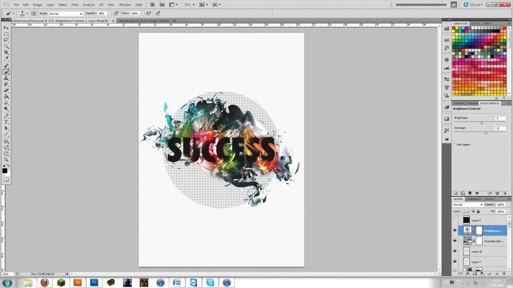
Step 8
At this point we decided to add some more highlights by painting a few colours at low opacity (48%), using a very large soft brush (257px). Set this layer’s blending mode to Overlay and enhance it by adding Hue/Saturation and Brightness/Contrast adjustment layers to add variety to the overall look.
Step 9
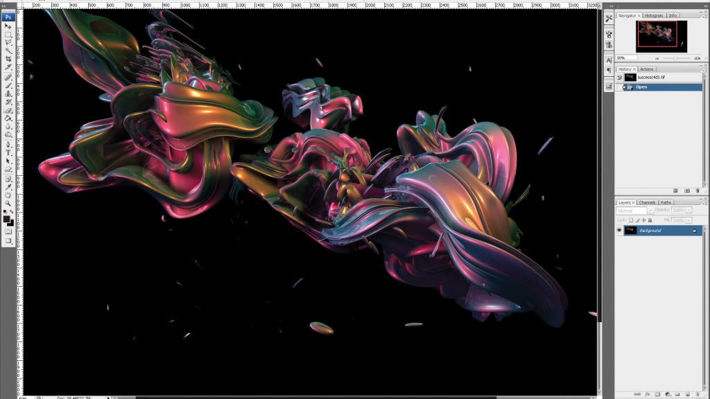
To give a little more life to the piece, we’ll need some organic ‘spark’ effects. For best results, you need to working in true 3D. (If you don’t have a 3D application, use the renders we’ve provided in the project files and skip to step 14.) Open Cinema 4D and create a document containing a tube (Objects > Primitives > Tube). Select the tube and hit Cmd to make it editable.undefined.
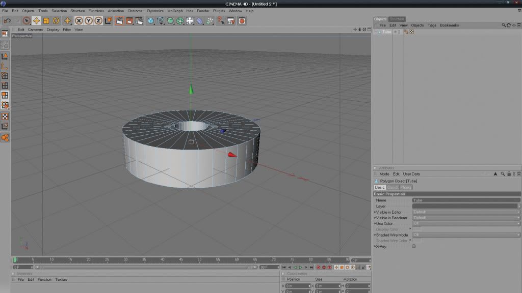
Step 10
Make sure Polygons is selected (Tools > Polygons), then go to Structure > Extrude. Click and drag on the tube to extrude the polygons, then select Structure > Inner Extrude and repeat. Finally, go to Structure > Extrude and once again click and drag. We’re aiming to create something that looks like a stack of plates.
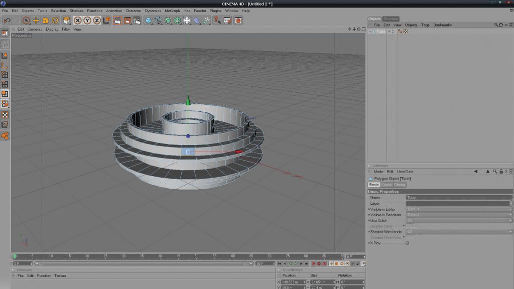
Step 11
Duplicate, rotate, move and resize what you have, then go to Objects > Deformation and add some Deformers – our favourites are Formula, Wind, Twist and Bend. We also added a couple of Explosion FX deformers for good measure. Build up the render until it looks suitably crazy.
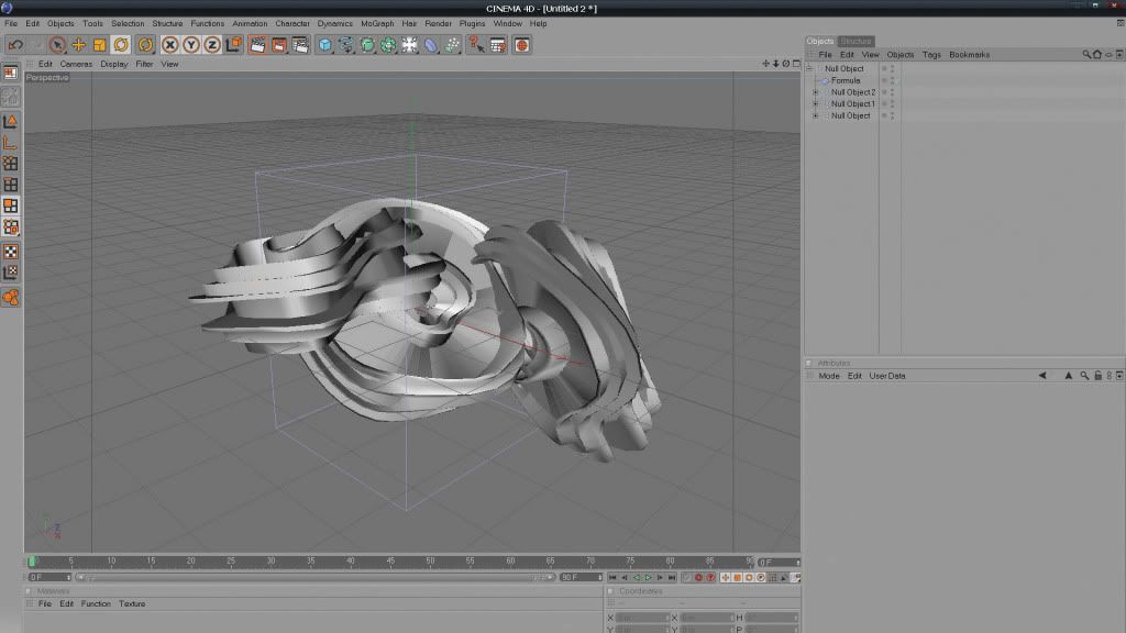
Step 12
We need to add colours and reflections to our shape. Start by creating a new material in the Material Editor. For a strong colour variation, use a shiny, grungy texture; to get a glossy feel, select Lumas in the Luminance settings. In the Reflection settings, select Fresnel, and add a sharply peaked effect in the Specular settings.
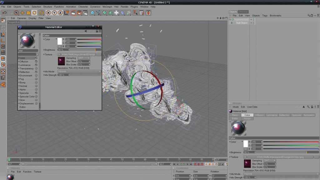
Step 13
Place lights of different colours around the object to add a variety of highlights (Objects > Scene > Lights). Ensure they are all of type Omni and turn on Soft Shadows. Render the object from two viewpoints around it, saving the results as A5 TIFFs with separate alpha channels. You can adjust resolution and alpha channel preferences in Render > Render Settings.
Final Step
Open your renders in Photoshop and paste them into the composition at the top of the layer stack. Set their blending modes to Lighten. Now it’s just a matter of placing the renders appropriately so that the effects match up with the composition underneath. Erase any parts that don’t fit until you’re satisfied with the result.

Soucer : Link


0 komentar:
Posting Komentar
Banyak tanya Banyak bingung banyak bata.. :D